
Step into the Future of Home Decor: Embrace the Hottest Color Trends of 2025
Tired of your outdated interiors? Want to refresh your home with a modern touch that feels both timeless and on-trend? The secret to transforming any space lies in the power of color. As we move into 2025, interior design experts are forecasting four distinctive color trends that promise to revolutionize home aesthetics.
Color isn’t just about aesthetics—it’s about creating atmosphere, influencing mood, and expressing personality. The right palette can transform a mundane room into a sanctuary that resonates with your lifestyle and aspirations.
Get ready to discover the four color trends set to revolutionize home interiors in 2025 and learn how to seamlessly incorporate them into your space. From serene greens to warm terracottas, these palettes offer something for every taste and interior style.
Sage Green: Cultivate Calm and Elegance with 2025’s Serene Green Hue
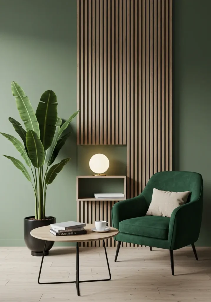
Why Sage Green is Trending in 2025:
Sage green has emerged as the definitive color of tranquility for 2025. This sophisticated hue strikes the perfect balance between gray and green, creating an atmosphere of understated elegance and natural serenity. Its rise in popularity comes as no surprise in our increasingly fast-paced world—sage green offers a visual respite, bringing the calming elements of nature indoors.
What makes sage green particularly appealing is its remarkable versatility. Unlike bolder greens, sage creates a neutral backdrop that complements virtually any decor style, from minimalist Scandinavian to eclectic bohemian. Its muted quality allows it to function almost as a neutral while still providing more character than traditional beige or gray.
Available in various intensities—from barely-there whispers to more saturated tones—sage green adapts beautifully to different lighting conditions and room sizes, making it an accessible choice for any home.
Best Rooms to Use Sage Green:
Living Room: Transform your main gathering space with sage green walls for a relaxing environment that encourages conversation and unwinding. This hue creates a perfect backdrop for both natural materials and contemporary furnishings, making it ideal for family time and entertaining guests.
Home Office: In a space dedicated to productivity, sage green promotes focus and concentration without being distracting. Its connection to nature helps reduce stress during work hours, making it the perfect color for today’s home-based professionals.
Bedroom: The naturally soothing properties of sage green make it perfect for promoting restful sleep and creating a sanctuary-like atmosphere in your most personal space.
Bathroom: Create a spa-like retreat with sage green tiles or walls, complemented by natural materials like wood and stone for an organic, relaxing environment.
Sage Green Color Palettes & Combinations:
Sage Green + Off-white and Beige: For a Scandinavian-inspired space that feels clean, bright, and impossibly calm, pair sage with warm whites and natural beiges. This combination creates an airy, light-filled effect that makes spaces feel larger and more serene.
Sage Green + Mustard Yellow: For those who want to maintain calm while adding personality, introduce selective pops of mustard yellow through cushions, throws, or art pieces. This unexpected combination brings dynamic energy while still feeling sophisticated.
Sage Green + Wood and Brass: Natural wood tones—particularly medium to light finishes—complement sage green beautifully, reinforcing the connection to nature. Add brass fixtures or accessories for warmth and subtle luxury that elevates the entire palette.
Tips for Decorating with Sage Green:
- Start small if you’re hesitant—incorporate sage through textiles, ceramics, or a single piece of furniture before committing to wall color.
- Consider the light in your room—north-facing spaces may benefit from a slightly warmer sage tone, while south-facing rooms can handle cooler variations.
- Layer different textures in sage green (like linen, velvet, and wool) to create visual interest within a monochromatic scheme.
- For maximum impact with minimal commitment, paint a sage green accent wall behind a bed or sofa.
Discover sage green paint swatches and start planning your serene space! This versatile color works well in both traditional color blocking and more contemporary color-drenching techniques.
Terracotta: Infuse Sophistication and Mediterranean Warmth into Your 2025 Home
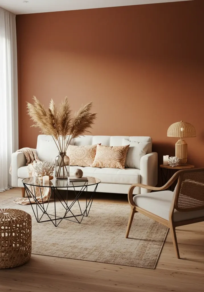
The Enduring Appeal of Terracotta in 2025:
Terracotta—that beautiful earthy hue that blends orange, pink, and brick tones—has transcended its status as a passing trend to become a mainstay in sophisticated interiors. In 2025, this color continues to reign supreme for those seeking to infuse their spaces with warmth, character, and a touch of Mediterranean charm.
The appeal of terracotta lies in its unique ability to feel simultaneously timeless and current. It evokes sun-baked Mediterranean landscapes, ancient pottery, and the natural warmth of earth, bringing an authentic, grounded quality to contemporary spaces. Unlike cooler neutrals that dominated previous years, terracotta introduces a human element—warm, inviting, and connected to cultural traditions across the globe.
What makes this trend particularly relevant in 2025 is its softer interpretation. Today’s terracotta leans toward dustier, more muted versions that maintain warmth without overwhelming spaces, making it accessible for a variety of homes and room sizes.
Where to Use Terracotta Effectively:
Dining Room: Terracotta creates an atmosphere of conviviality and warmth—perfect for shared meals and entertaining. The color stimulates conversation and appetite, making it ideal for spaces dedicated to gathering and communion.
Kitchen: From terracotta tiles to painted cabinets or accessories, this warm hue creates an inviting heart for the home. It pairs beautifully with natural materials like wood and stone, enhancing the authentic, lived-in quality that makes kitchens feel like home.
Accent Walls: Due to its natural light-absorbing qualities, terracotta works wonderfully as an accent wall in spaces where you want to create a focal point without overwhelming the entire room.
Furniture and Textiles: For a less permanent commitment, introduce terracotta through upholstered pieces, cushions, throws, or rugs—allowing you to experience the warmth of this trend without a major renovation.
Terracotta Color Palettes & Combinations:
Terracotta + White: This classic combination enhances terracotta’s natural luminosity. Crisp whites create striking contrast against the warmth of terracotta, preventing the color from feeling heavy or dated.
Terracotta + Green: Channel Mediterranean gardens with this naturally complementary pairing. From olive greens to deeper emeralds, green brings out the earthy quality of terracotta while adding freshness and vitality.
Terracotta + Gold: For a luxurious interpretation, pair terracotta with touches of gold or brass. This combination adds sophistication and elevates the earthy tone into something truly special, perfect for creating a memorable impression in social spaces.
Tips for Decorating with Terracotta:
- Use terracotta strategically, especially in smaller spaces where its intensity might overwhelm if used wall-to-wall.
- Consider balancing terracotta with plenty of white space to prevent it from feeling too heavy.
- Incorporate natural textures like rattan, jute, and linen to enhance the organic quality terracotta brings.
- Look beyond paint—terracotta tiles, ceramics, and textiles offer ways to introduce this color without commitment.
Explore terracotta tiles, paints, and fabrics to bring Mediterranean charm home! This versatile hue works equally well in rustic settings and more refined, contemporary spaces.
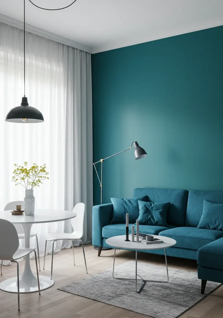
Petrol Blue: Add Depth and Drama with 2025’s Chic and Mysterious Petrol Blue

Petrol Blue: The Chic and Timeless Choice for 2025:
Petrol blue—a sophisticated blend of deep blue and green undertones—emerges as 2025’s answer to creating spaces with depth, character, and timeless elegance. This luxurious hue manages to be both calming and dramatic, offering a perfect alternative for those who appreciate color but find navy too traditional or teal too vivid.
The allure of petrol blue lies in its mysterious quality—evoking images of deep ocean waters and precious stones. It brings an intellectual sophistication to interiors while maintaining a connection to the natural world. Unlike more trend-driven colors, petrol blue has staying power, continuing to feel fresh and interesting year after year.
In 2025’s interiors, this color speaks to our collective desire for spaces that feel cocooning and substantial—a reaction to years of minimalism and pale palettes. Petrol blue creates rooms with presence and personality while maintaining an understated elegance.
Ideal Rooms for Petrol Blue:
Living Room Accent Wall: Create instant sophistication with a petrol blue focal wall behind key furniture pieces. This application adds depth without overwhelming the space, establishing a warm and contemporary ambiance perfect for evening relaxation.
Bedroom Headboard Wall: Petrol blue behind the bed creates a soothing yet distinctive sleeping environment. Its depth promotes a sense of calm conducive to quality sleep while adding unmistakable character to your most personal space.
Home Library or Reading Nook: The intellectual quality of petrol blue makes it perfect for spaces dedicated to reading and contemplation, creating an atmosphere of focused concentration and peaceful reflection.
Powder Rooms and Small Bathrooms: In compact spaces like powder rooms, petrol blue can create a jewel-box effect, transforming utilitarian spaces into memorable design moments.
Petrol Blue Color Palettes & Combinations:
Petrol Blue + Mustard: For spaces with undeniable personality and energy, combine petrol blue with strategic touches of mustard yellow. This dynamic pairing balances cool and warm elements for an interior with confident character.
Petrol Blue + White: For a cleaner, more contemporary effect, pair petrol blue with crisp whites. This high-contrast combination creates striking definition and prevents the deeper color from feeling heavy or overwhelming.
Petrol Blue + Wood: Natural wood tones, particularly medium to light varieties, soften petrol blue’s intensity while enhancing its connection to nature. This combination creates a sophisticated yet approachable marine-inspired atmosphere.
Petrol Blue + Brass Accents: Perhaps the most harmonious pairing, brass and gold metallics bring out the hidden warmth in petrol blue, creating a luxurious effect that feels both contemporary and timeless.
Tips for Decorating with Petrol Blue:
- Consider the size and light in your space—petrol blue can make small, dim rooms feel cozy and intentional rather than cramped.
- Use lighting strategically to showcase the complex undertones in petrol blue, which can shift from more green to more blue depending on time of day.
- Balance petrol blue’s depth with lighter elements to prevent spaces from feeling too dark or heavy.
- For a sophisticated approach, try mixing different textures in the same petrol blue shade—velvet sofas, matte walls, and glossy ceramics create visual interest without color chaos.
Discover petrol blue paints and decor to create a sophisticated and deep space! This versatile hue works equally well in traditional and contemporary settings, offering timeless appeal with modern sensibility.
Apricot: Inject Joy and Vitality with 2025’s Refreshing and Dynamic Apricot Hue

Apricot: The Fresh and Versatile Star of 2025 Decor:
Apricot—a delightful blend of orange, pink, and yellow undertones—emerges as 2025’s answer to bringing optimism and energy into home interiors. This surprisingly versatile hue offers the perfect balance of warmth and freshness, creating spaces that feel simultaneously cozy and invigorating.
What makes apricot particularly relevant in 2025 is its ability to introduce warmth without the intensity of brighter oranges or reds. It carries sunshine and positivity into interiors while maintaining an underlying sophistication that prevents it from feeling juvenile or trendy. Apricot connects to nature—evoking sunrise skies, fresh fruit, and summer warmth—bringing organic vitality to contemporary spaces.
As homeowners increasingly seek interiors that support emotional wellbeing, apricot offers a color solution that genuinely lifts the spirits and creates an atmosphere of gentle positivity—a subtle but effective way to influence the mood of a space.
Where to Bring Apricot’s Energy:
Living Room Accent Wall: An apricot feature wall creates an instantaneously warmer, more welcoming atmosphere. This application adds vitality without overwhelming the space, establishing a perfect backdrop for both neutral and contrasting furniture.
Children’s Bedroom: The inherent playfulness and warmth of apricot make it ideal for creating cozy, imaginative spaces for children that can easily grow with them through different developmental stages.
Kitchen Accents: Rather than full commitment, introduce apricot through backsplashes, curtains, or smaller appliances to brighten the heart of the home without major renovation.
North-Facing Rooms: Spaces with cooler, northern light benefit tremendously from apricot’s warming capabilities, counteracting bluish natural light with its sunny undertones.
Apricot Color Palettes & Combinations:
Apricot + Beige or Off-White: For an elegant, sophisticated interpretation of this joyful color, pair it with warm neutrals. This combination allows apricot to shine while maintaining an overall sense of calm and restraint.
Apricot + Mint Green: Channel the freshness of spring with this unexpectedly harmonious combination. Mint’s cool crispness balances apricot’s warmth, creating a dynamic yet approachable palette perfect for creating memorable interiors.
Apricot + Lemon Yellow: For the color confident, this combination creates spaces with undeniable energy and optimism. Use this bold pairing in spaces where you want to stimulate conversation and creativity.
Apricot + Deep Teal: Create dramatic tension with this complementary pairing that balances apricot’s warmth with teal’s cool depth. This sophisticated combination works particularly well in social spaces like dining rooms.
Tips for Decorating with Apricot:
- Start with smaller applications if you’re color-shy—throw pillows, artwork, or ceramics allow you to experience apricot’s benefits without full commitment.
- Consider the specific undertones in your chosen apricot shade—those leaning more orange create energy, while pinker variations feel more romantic and soft.
- Balance apricot with plenty of neutrals to prevent color overload, particularly in smaller spaces.
- Use apricot to create focal points that draw the eye to architectural features or important areas within a room.
Explore apricot paints, textiles, and accessories to bring sunshine into your home! This adaptable color works beautifully in both contemporary and traditional settings, offering unexpected versatility despite its distinctive character.
Embrace the 2025 Color Palette and Create Your Dream Home
As we’ve explored, 2025’s definitive color trends offer something for every aesthetic preference and functional need. From the serene tranquility of sage green to the sophisticated warmth of terracotta, the mysterious depth of petrol blue, and the joyful energy of apricot—these colors provide endless possibilities for refreshing your home.
What makes these trends particularly compelling is their versatility and staying power. Unlike more fleeting color fads, these hues connect to enduring elements in nature and design history, ensuring your investment in these palettes will remain relevant for years to come.
Remember that color is ultimately personal—the most successful interiors reflect the preferences and lifestyle of those who inhabit them. Use these trends as inspiration rather than rigid rules, adapting them to complement your existing furnishings and architecture.
Start planning your 2025 home makeover and create a space that reflects your unique style while embracing these contemporary color directions. Whether you commit to a full room transformation or simply introduce these hues through accessories and accent pieces, the impact on your daily experience at home will be undeniable.
Frequently Asked Questions about 2025 Color Trends
Consider your existing furnishings, the natural light in your space, and how you want each room to feel. Sage green and petrol blue tend to work well in spaces where you want tranquility, while terracotta and apricot bring energy and warmth. Start with small applications of colors you’re drawn to and observe how they make you feel before committing to larger applications.
Absolutely! The key is creating intentional transitions between spaces and ensuring each color has room to shine. Consider using one dominant trend color per room while incorporating subtle echoes of other trend colors through accessories. Alternatively, use neutral transitional spaces to create breathing room between more colorful areas.
Focus on furniture, textiles, and decor items. Slipcovers, throw pillows, area rugs, artwork, and decorative objects offer commitment-free ways to bring these colors into your space. Many retailers now offer furniture in trend-forward colors, making it easier than ever to incorporate these hues without changing your walls.
The longevity of any color trend depends on application. Consider more permanent elements in neutral tones while using these trend colors for more easily changeable elements. Alternatively, choose the most timeless versions of these hues—slightly muted variations tend to have more staying power than their brighter counterparts.
Beyond traditional shelter magazines and design websites, look to platforms like Pinterest and Instagram where real homeowners share their experiences with these colors. Search specific hashtags like #sagegreenhome or #terracottadecor to find authentic applications that might better reflect your own home’s conditions and constraints.


Pingback: Groovy Vibes Only: Creating the Ultimate 70s Bedroom Retreat -
Pingback: Escape to Your Oasis: Creating a Dreamy Boho Bathroom -